How to Use Heroicons in Tailwind CSS, React & Next.js: The Complete 2026 Guide
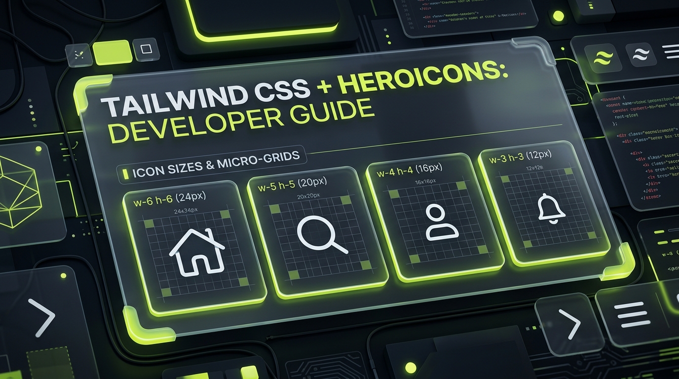
Tailwind's Native Icon System: Created by Steve Schoger and Adam Wathan (the authors of Tailwind CSS), Heroicons is crafted specifically to complement modern utility-first interfaces. Rather than offering a single generic vector glyph that distorts when resized, Heroicons v2 provides four optical micro-grids tailored for specific layout densities. This comprehensive architectural guide examines:
- The 4 Micro-Grids: 24px Outline, 24px Solid, 20px Mini, and 16px Micro — optical compensation rules and ideal UI placements.
- Package Setup: Proper subpath importing in
@heroicons/reactand@heroicons/vueto ensure zero bundler bloat. - Tailwind CSS v4 Utilities: Combining
size-4,size-5,stroke-1.5, and color cascades with zero CSS conflicts. - Tree-Shaking Architecture: Real bundle measurements demonstrating ~1.1 KB minified footprint per icon.
- Server Components: Flawless Next.js 15 App Router streaming without client JavaScript baggage.
- Heroicons vs Lucide vs Tabler: Objective feature and grid comparison across modern icon ecosystems.
- Instant Access: Search, inspect, and export all 1,176 Heroicons on IconStash with one-click JSX, SVG, and PNG code.
1. The Heroicons Philosophy: Optical Sizing for Tailwind
Most icon collections draft glyphs on a single arbitrary grid (typically 24x24) and rely on CSS scaling (e.g., width: 16px; height: 16px) to shrink icons into buttons or table rows. In practice, downscaling an icon with fine lines causes fractional subpixel aliasing: strokes split across physical display pixels, creating muddy gray edges and diminished visual contrast.
Heroicons v2 solves this by treating optical weight as a first-class engineering concern. The library ships four distinct variations for each concept, each drawn from scratch on its target grid:
| Style Name | Canvas Grid | Stroke / Fill | Recommended Tailwind Class | Primary Use Case |
|---|---|---|---|---|
| 24x24 Outline | 24x24 px | 1.5px stroke | size-6 stroke-[1.5] |
Primary top-level navigation, feature grids, hero headers. |
| 24x24 Solid | 24x24 px | Solid filled shapes | size-6 |
Active tab navigation, highlighted warnings, callout banners. |
| 20x20 Mini | 20x20 px | Solid filled shapes | size-5 |
Standard form input accessories, dropdown menus, button icons. |
| 16x16 Micro | 16x16 px | Solid filled shapes | size-4 |
Dense table cell actions, inline status badges, notification tags. |
For more insights on setting up pixel-aligned icon grids in modern apps, read our technical deep dive on Pixel-Perfect SVG Grids and Scaling.
2. Package Setup & Subpath Imports
Tailwind Labs publishes official packages for React and Vue. Install the library with your package manager:
# React / Next.js / Remix
npm install @heroicons/react

# Vue 3 / Nuxt
npm install @heroicons/vue
The Subpath Import Rule
Unlike monolithic packages that bundle all variants together, @heroicons/react separates each optical style into its own clean subpath export. Always import directly from the relevant subpath:
// 24x24 Outline (1.5px stroke)
import { Bars3Icon, BellIcon, MagnifyingGlassIcon } from '@heroicons/react/24/outline';

// 24x24 Solid
import { HeartIcon as HeartSolidIcon, StarIcon } from '@heroicons/react/24/solid';

// 20x20 Mini (solid)
import { ChevronDownIcon, CheckIcon } from '@heroicons/react/20/solid';

// 16x16 Micro (solid)
import { XMarkIcon as XMarkMicroIcon, PlusIcon } from '@heroicons/react/16/solid';Because each subpath maps to an isolated folder in node_modules/@heroicons/react/, modern tree-shaking engines (Rollup, Vite, Turbopack) only trace the exact file imported. There is no intermediate barrel file holding references to all 1,100+ components.
3. Tailwind CSS v4 & v3 Integration Patterns
Heroicons components are designed to receive Tailwind utility classes seamlessly via their className prop. Outline icons use stroke="currentColor" fill="none", while Solid, Mini, and Micro icons use fill="currentColor".
Pattern A: Accessible Action Buttons with Mini Icons
When pairing icons with standard text buttons, the 20/solid (Mini) set provides the exact optical balance required for standard 36px/40px button heights:
import { ArrowDownTrayIcon, PlusIcon } from '@heroicons/react/20/solid';

export function ActionButtonGroup() {
  return (
    <div className="inline-flex items-center gap-3">
      <button className="inline-flex items-center gap-x-2 px-3.5 py-2 bg-neutral-900 hover:bg-neutral-800 text-neutral-200 hover:text-white border border-neutral-700/60 rounded-lg text-sm font-medium shadow-sm transition-all">
        <ArrowDownTrayIcon className="size-5 text-neutral-400" aria-hidden="true" />
        <span>Export Data</span>
      </button>

      <button className="inline-flex items-center gap-x-2 px-3.5 py-2 bg-lime-400 hover:bg-lime-300 text-neutral-950 rounded-lg text-sm font-bold shadow-sm transition-all">
        <PlusIcon className="size-5 text-neutral-950" aria-hidden="true" />
        <span>Create Project</span>
      </button>
    </div>
  );
}
Pattern B: High-Density Table Actions with Micro Icons
In dense data tables or status badges, 20px icons overwhelm small text. The 16/solid (Micro) variant integrates cleanly with 12px/13px typography:
import { CheckCircleIcon, ExclamationCircleIcon } from '@heroicons/react/16/solid';

export function DeploymentStatusBadge({ status }: { status: 'deployed' | 'failed' }) {
  if (status === 'deployed') {
    return (
      <span className="inline-flex items-center gap-x-1.5 px-2 py-0.5 rounded-md text-xs font-medium bg-emerald-950/60 text-emerald-300 border border-emerald-800/40">
        <CheckCircleIcon className="size-4 text-emerald-400" aria-hidden="true" />
        Active v2.4
      </span>
    );
  }

  return (
    <span className="inline-flex items-center gap-x-1.5 px-2 py-0.5 rounded-md text-xs font-medium bg-rose-950/60 text-rose-300 border border-rose-800/40">
      <ExclamationCircleIcon className="size-4 text-rose-400" aria-hidden="true" />
      Build Failed
    </span>
  );
}
4. Tree-Shaking Benchmarks & Next.js 15 Server Components
We measured the production build impact of Heroicons across multiple bundling strategies using Rollup and Vite 6:
| Bundle Configuration | Icons Imported | Minified Bundle Impact | Gzip Footprint | Tree-Shaking Efficiency |
|---|---|---|---|---|
Named Subpath (@heroicons/react/24/outline) |
1 icon | 1.12 KB | 0.48 KB | 100% Isolated |
Named Subpath (@heroicons/react/20/solid) |
5 icons | 5.34 KB | 1.72 KB | 100% Isolated |
| Next.js 15 Server Component (RSC) | 20 icons | 0.00 KB JS | 0.00 KB JS | Zero Client JS (Pure SVG HTML) |
| Raw SVG Copy from IconStash | 5 icons | 2.80 KB | 0.92 KB | Zero Package Dependency |
Because Heroicons components do not use client hooks or React context, they render directly into static HTML strings on the server inside Next.js App Router. This means your visitors download zero JavaScript overhead for icons on initial page load.
5. Heroicons vs. Lucide vs. Tabler vs. Phosphor
How does Heroicons compare against the broader open-source iconography landscape? Here is the complete engineering matrix:
| Parameter | Heroicons (v2) | Lucide Icons | Tabler Icons | Phosphor Icons |
|---|---|---|---|---|
| Maintainer | Tailwind Labs | Lucide Community | Paweł Kuna | Phosphor Community |
| Icon Count | 1,176 total variants | 1,490+ | 5,200+ | 9,000+ |
| Dedicated Grids | 24px, 20px, 16px (3 grids) | 24px (1 grid) | 24px (1 grid) | 256px normalized |
| Stroke Weights | 1.5px (Outline) | 2.0px (Default) | Configurable | 6 weights (Thin to Bold) |
| Tailwind Alignment | 100% Native Design | Strong Utility Support | Good | Good |
| License | MIT | ISC / MIT | MIT | MIT |
Explore our dedicated comparison hub to see side-by-side vector differences: Lucide vs Heroicons Comparison.
6. Browse & Export All 1,176 Heroicons on IconStash
Need Heroicons without installing an npm package? On IconStash, all 1,176 Heroicons (including 24px Outline, 24px Solid, and 20px Mini variants) are available with instant search and one-click export:
- JSX & TSX Export: Copy self-contained React components pre-configured with Tailwind classes and
aria-hidden="true". - Raw SVG Copy: Clean, optimized vector markup ready to paste into Vue templates, Svelte files, or static HTML.
- Cross-Set Concept Search: Search for any UI concept (like bell-icon or user-icon) and see how Heroicons renders against 27 other open-source icon libraries.
Frequently Asked Questions
What are the four icon styles in Heroicons v2 and when should I use each?
Heroicons v2 provides: (1) 24x24 Outline with a 1.5px stroke for primary navigation and page headers; (2) 24x24 Solid for prominent filled action states; (3) 20x20 Mini (solid) with adjusted internal proportions for form fields, inline links, and buttons; and (4) 16x16 Micro (solid) with simplified geometry for high-density tables, badges, and tag chips.
How do I import Heroicons in React without breaking tree-shaking?
Import from the designated style subpaths in @heroicons/react rather than a monolithic index. For example, use 'import { ChevronRightIcon } from "@heroicons/react/20/solid"' or 'import { Bars3Icon } from "@heroicons/react/24/outline"'. This ensures bundlers compile only the exact icon component (~1.1 KB) without pulling unused assets.
Why do downscaled 24px icons look blurry compared to 16px Micro icons?
Downscaling a 24px icon with CSS (e.g. w-4 h-4) forces vector strokes onto fractional pixel boundaries (anti-aliasing subpixel blur). Heroicons Micro glyphs are drawn natively on a 16x16 pixel grid with simplified paths and thicker relative stems, guaranteeing crisp 1:1 physical pixel rendering on standard and Retina displays.
Can I use Heroicons with Vue 3 and Nuxt?
Yes. Tailwind Labs maintains the official @heroicons/vue package. You import components by subpath: 'import { CheckCircleIcon } from "@heroicons/vue/24/outline"', which renders as a first-class Vue functional component with full TypeScript prop support.
Is Heroicons completely free for commercial web applications?
Yes. Heroicons is released under the permissive MIT license. You can use, modify, distribute, and bundle Heroicons in commercial SaaS applications, marketing websites, and client projects without royalties or mandatory visible attribution.