Understanding SVG viewBox — the definitive visual guide
This is the single most confusing concept in SVG for developers. Let's make it finally click.
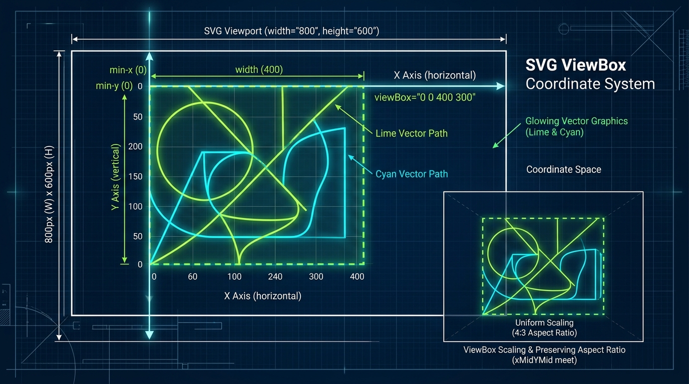
1. What viewBox Actually Does (The Camera Analogy)
If you've ever pasted an SVG into your HTML and found it completely invisible, cut off in half, or inexplicably tiny in the top-left corner, you have encountered the wrath of the viewBox. Understanding this attribute is the single most important hurdle to clear for mastering Scalable Vector Graphics.
The best way to think about the SVG viewBox is to think of it like a camera viewfinder. When you draw paths and shapes in an SVG, you are painting on an infinite canvas. But an infinite canvas cannot be displayed on a webpage. You need to tell the browser exactly which part of that infinite canvas it should capture and display on the screen.
The viewBox is the lens of that camera. It defines the coordinates and dimensions of the rectangle in your infinite SVG coordinate system that will be mapped to the actual physical size (width and height) of your SVG element in the browser.
Imagine you draw a house at coordinate X: 100, Y: 100 on the SVG canvas. If your viewBox is looking at X: 0, Y: 0 with a small width, it won't see the house. If you pan the camera (change the x/y of the viewBox) to X: 100, Y: 100, the house suddenly appears perfectly centered.
2. The Four Values Explained
The viewBox attribute accepts four numbers separated by spaces or commas: min-x, min-y, width, and height.
<svg viewBox="min-x min-y width height">...</svg>Let's break down what each of these numbers does:
- min-x: The x-coordinate of the top-left corner of your camera lens. Changing this pans the camera left or right across the infinite canvas.
- min-y: The y-coordinate of the top-left corner of your camera lens. Changing this pans the camera up or down.
- width: The width of your camera lens in user space units (the coordinate system of the drawing itself). A larger width means you are zooming out; a smaller width means you are zooming in.
- height: The height of your camera lens in user space units. Like width, it dictates zoom level and aspect ratio.
Basic viewBox Demo
Here is a basic viewBox mapping showing a 24x24 grid. This is standard for icon sets like Feather or Heroicons.
<!-- A simple 24x24 icon with its viewBox set perfectly -->
<svg viewBox="0 0 24 24" width="24" height="24" xmlns="http://www.w3.org/2000/svg">
  <circle cx="12" cy="12" r="10" stroke="black" stroke-width="2" fill="none" />
</svg>
In this example, the camera starts at 0,0. The camera is 24 units wide and 24 units high. The circle is drawn at cx="12" and cy="12" (the exact center), with a radius of 10. Because the circle's diameter (20) fits comfortably within the camera's viewport (24x24), the entire circle is visible with a small margin.
3. viewBox vs width/height — How They Interact
A massive point of confusion is the relationship between the viewBox and the width / height attributes (or CSS width/height).
Rule of thumb: The viewBox defines the internal coordinate system and aspect ratio. The width and height attributes define the external physical space the SVG takes up in your HTML layout.
When the aspect ratio of the viewBox matches the aspect ratio of the CSS width/height, everything scales perfectly. If you have viewBox="0 0 100 100" (a 1:1 square) and render it with CSS width: 500px; height: 500px;, the browser smoothly maps the 100 internal units to the 500 physical pixels (a 5x scale factor). 1 SVG unit becomes 5 screen pixels.
What happens when ratios mismatch?
If you have a 1:1 viewBox (e.g., 0 0 100 100) but you stretch the HTML element to a 2:1 rectangle (e.g., width="200" height="100"), the SVG has to decide how to resolve this conflict. By default, it will center the internal graphic within the larger physical space without stretching or distorting the graphic itself.
<!-- ViewBox is 100x100 (1:1), Container is 200x100 (2:1) -->
<svg viewBox="0 0 100 100" width="200" height="100" style="border: 1px solid red;">
  <circle cx="50" cy="50" r="50" fill="blue" />
</svg>
The blue circle will remain perfectly round (not stretched into an oval) and will be vertically and horizontally centered inside the 200x100 red border. This behavior is governed by an attribute called preserveAspectRatio.
4. preserveAspectRatio Deep Dive
The preserveAspectRatio attribute tells the browser what to do when the viewBox aspect ratio does not match the physical SVG dimensions. It is the SVG equivalent of CSS object-fit and object-position combined.
The default value is xMidYMid meet. Let's break down the syntax:
preserveAspectRatio="[alignment] [meetOrSlice]"
- alignment: Dictates where the graphic sticks. It's composed of an X alignment (xMin, xMid, xMax) and a Y alignment (YMin, YMid, YMax).
- meet: Scales the graphic as large as possible while keeping the entire viewBox visible (like CSS
object-fit: contain). - slice: Scales the graphic to completely fill the viewport, cutting off anything that overflows (like CSS
object-fit: cover). - none: Disables aspect ratio preservation. The graphic will squish and stretch to fill the dimensions exactly (like CSS
object-fit: fill).
Comparison Table of preserveAspectRatio values
<!-- 1. Default: Centered and contained -->
<svg viewBox="0 0 100 100" preserveAspectRatio="xMidYMid meet"></svg>

<!-- 2. Aligned to the left/top and contained -->
<svg viewBox="0 0 100 100" preserveAspectRatio="xMinYMin meet"></svg>

<!-- 3. Centered, but filling the entire container (cropping edges) -->
<svg viewBox="0 0 100 100" preserveAspectRatio="xMidYMid slice"></svg>

<!-- 4. Aligned to the bottom right and filling the container -->
<svg viewBox="0 0 100 100" preserveAspectRatio="xMaxYMax slice"></svg>

<!-- 5. Force stretching/squishing (ignoring aspect ratio entirely) -->
<svg viewBox="0 0 100 100" preserveAspectRatio="none"></svg>
5. Common Mistakes and How to Fix Them
Mistake 1: Icons appearing cut off
If you see a sharp edge cutting off your SVG graphic, it usually means your drawing paths extend outside the bounds of the camera lens (the viewBox). For example, drawing a circle with cx="12" cy="12" r="14" in a viewBox="0 0 24 24" will result in cut off edges, because a radius of 14 means the circle spans from -2 to 26.
The Fix: Either reduce the size of the drawn elements, or expand the viewBox. For example, changing to viewBox="-2 -2 28 28" would encompass the overflowing circle.
Mistake 2: Missing viewBox altogether
If you remove the viewBox and rely solely on width and height, your SVG becomes rigid. It will draw using standard pixel coordinates mapped 1:1. It will no longer scale elegantly when put into responsive CSS layouts.
The Fix: Always, always include a viewBox. If you have an SVG with width="500" height="300" but no viewBox, simply add viewBox="0 0 500 300" to make it responsive.
Mistake 3: Unwanted whitespace around an icon
This happens when the viewBox is much larger than the paths contained inside it. The camera is "zoomed out" too far.
The Fix: You need to crop the viewBox to perfectly bound the artwork. You can do this visually in Illustrator/Figma (by shrinking the artboard), or programmatically using JavaScript's getBBox() method.
// Debugging Snippet: Find the exact bounding box of your graphics
const svgElement = document.querySelector('svg');
// getBBox() returns the actual drawn boundaries of the inner graphic
const bbox = svgElement.getBBox();
console.log(bbox.x, bbox.y, bbox.width, bbox.height);

// You can use these values to programmatically set a tight viewBox
svgElement.setAttribute('viewBox', `${bbox.x} ${bbox.y} ${bbox.width} ${bbox.height}`);
6. Responsive SVG Patterns
To make an SVG infinitely scalable while respecting its original aspect ratio, you combine the viewBox with modern CSS.
The standard responsive CSS trick involves stripping inline width/height attributes in favor of CSS widths.
/* CSS trick for responsive SVG containers */
.icon-wrapper {
  /* Set maximum boundaries for the container */
  max-width: 100%;
  width: 64px; /* Or any fluid size like 5vw */
}

.icon-wrapper svg {
  /* Ensure the SVG fills its container flexibly */
  display: block;
  width: 100%;
  height: auto;
}
Because the SVG has a viewBox, height: auto allows the browser to calculate the correct height dynamically based on the viewBox's intrinsic aspect ratio.
7. viewBox in Icon Systems
When you download icons from different sources, some might be drawn on a 24x24 canvas, others on 512x512, and others on 100x100. If you try to mix these in your UI, they will render inconsistently.
You can normalize them using a JavaScript utility function before rendering. Here is an example of extracting and adapting viewBoxes from mixed source objects.
/**
 * JavaScript function to normalize viewBox across mixed icon sets
 * This scales coordinates to a unified 24x24 grid based on original viewBox.
 */
function normalizeIconGrid(svgString, targetSize = 24) {
  const parser = new DOMParser();
  const doc = parser.parseFromString(svgString, "image/svg+xml");
  const svg = doc.querySelector("svg");

  // Extract original viewBox or fallback to width/height
  const viewBoxAttr = svg.getAttribute('viewBox');
  let originalWidth = 24;

  if (viewBoxAttr) {
    originalWidth = parseFloat(viewBoxAttr.split(' ')[2]);
  } else if (svg.getAttribute('width')) {
    originalWidth = parseFloat(svg.getAttribute('width'));
  }

  // If it's already the target size, just return it
  if (originalWidth === targetSize) return svgString;

  const scale = targetSize / originalWidth;

  // Wrap inner content in a scaling group
  const innerHTML = svg.innerHTML;
  svg.innerHTML = `<g transform="scale(${scale})">${innerHTML}</g>`;
  svg.setAttribute('viewBox', `0 0 ${targetSize} ${targetSize}`);

  return svg.outerHTML;
}
8. Practical Recipes for Frameworks
SVG Sprite Sheets with viewBox
When building icon systems, SVG sprites using <symbol> are the gold standard. The critical trick is that every <symbol> must carry its own independent viewBox. When you <use> the symbol, it inherits that viewBox natively.
<!-- sprite.svg (hidden in the DOM) -->
<svg style="display: none;">
  <symbol id="icon-heart" viewBox="0 0 24 24">
    <path d="M12 21.35l-1.45-1.32C5.4 15.36 2 12.28 2 8.5 2 5.42 4.42 3 7.5 3c1.74 0 3.41.81 4.5 2.09C13.09 3.81 14.76 3 16.5 3 19.58 3 22 5.42 22 8.5c0 3.78-3.4 6.86-8.55 11.54L12 21.35z"/>
  </symbol>
  <symbol id="icon-star" viewBox="0 0 512 512">
    <!-- A star drawn on a totally different scale -->
    <polygon points="256,15 315,185 502,185 351,302 409,472 256,365 103,472 161,302 10,185 197,185"/>
  </symbol>
</svg>

<!-- In your HTML, both icons will perfectly adapt to a 32x32 CSS class -->
<style>.ui-icon { width: 32px; height: 32px; fill: currentColor; }</style>

<svg class="ui-icon"><use href="#icon-heart"></use></svg>
<svg class="ui-icon"><use href="#icon-star"></use></svg>
Dynamic viewBox in React / Vue
Sometimes you need to programmatically adjust the viewBox in a modern component framework, such as when building charting libraries or interactive zoom tools.
// React component with dynamic viewBox
import React, { useState } from 'react';

export const PanningCanvas = ({ children }) => {
  // We can treat our camera coordinates as component state
  const [camera, setCamera] = useState({ x: 0, y: 0, w: 100, h: 100 });

  const zoomIn = () => {
    setCamera(prev => ({
      ...prev,
      x: prev.x + 10,
      y: prev.y + 10,
      w: Math.max(20, prev.w - 20),
      h: Math.max(20, prev.h - 20)
    }));
  };

  return (
    <div className="canvas-container">
      <button onClick={zoomIn}>Zoom In</button>
      <svg
        viewBox={`${camera.x} ${camera.y} ${camera.w} ${camera.h}`}
        width="100%"
        height="500px"
        preserveAspectRatio="xMidYMid meet"
      >
        {children}
      </svg>
    </div>
  );
};
The viewBox Golden Rules
- Never delete it: Always define a viewBox. An SVG without one is basically an inflexible raster image.
- Remember the order:
min-x,min-y,width,height. - Control aspect ratios: Use
preserveAspectRatioif you are forcing SVGs into containers with a different dimensional ratio. - Rely on CSS: Control physical scaling using CSS
widthandheight: autorather than hardcoded SVG width/height attributes.