Animate SVG Paths with CSS
An exhaustive developer handbook covering the mathematics of dash arrays, offsets, timing equations, and advanced micro-interactions.
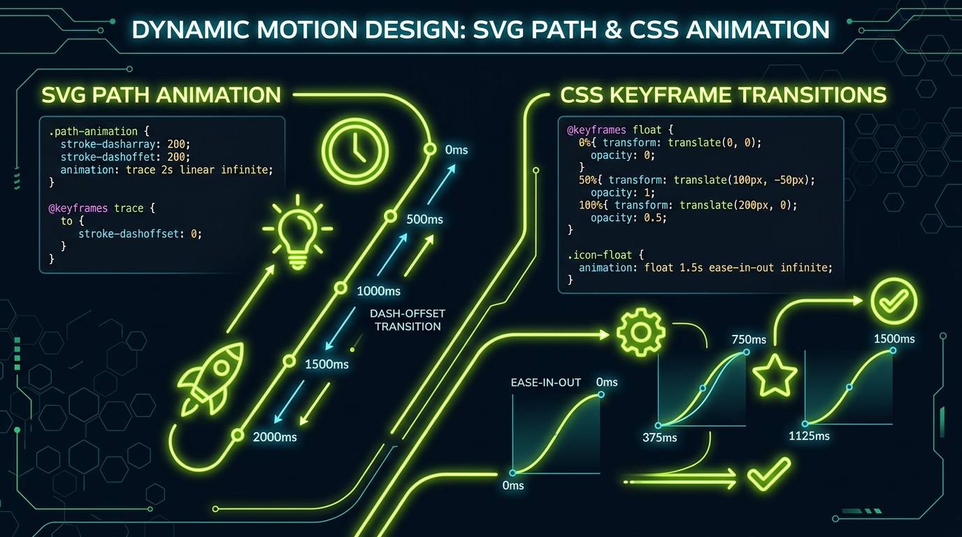
1. The Mechanics of Vector Tracing
Vector animations add immediate high-end polish to interfaces. The most popular animation style in modern web design is the **self-drawing path** or **line tracing** effect. This interaction makes checkmarks, loading loops, or company logos draw themselves on load or user hover.
To implement this in a web browser, we don't need heavy JavaScript timeline libraries (like GreenSock or Anime.js). Instead, we can build it natively and performantly using pure CSS transitions, keyframes, and two simple SVG attributes: stroke-dasharray and stroke-dashoffset.
2. The Core Properties: dasharray & dashoffset
The stroke-dasharray property styles a solid stroke into a series of dashed lines. It takes coordinate values representing alternating dash and gap lengths:
/* Creates a repeating pattern of 10px dash and 5px gap */
.vector-path {
  stroke-dasharray: 10 5;
}
The stroke-dashoffset property defines the distance into the dash pattern where the path starts rendering. By animating the offset, you slide the dashes along the path.
To animate a path from start to finish:
- Measure the total length of the vector path (let's assume it is
250px). - Set
stroke-dasharrayto250. This creates one long dash of 250px followed by an invisible gap of 250px. - Set the initial
stroke-dashoffsetto250. The gap fully offsets the stroke, rendering the line invisible. - Animate
stroke-dashoffsetdown to0. The solid dash slides back onto the path, creating the drawing effect.
3. Calculating SVG Path Length Dynamically
While basic shapes have predictable path lengths, complex custom icons require precise measurements. You can find this value using JavaScript's getTotalLength() method:
// Measure path length dynamically in JavaScript
const path = document.querySelector('.custom-draw-path');
const length = path.getTotalLength();

console.log(`Path length: ${length}px`);

// Set inline styles programmatically
path.style.strokeDasharray = length;
path.style.strokeDashoffset = length;
4. State Management & Micro-Interactions
To trigger these transitions during hover, focus, or click events, bind your styles to CSS selector states or framework conditions. Here is a production-ready example of a checkmark drawing itself inside a success card wrapper:
/* success-card.css */
.success-card .checkmark-circle {
  stroke-dasharray: 151;
  stroke-dashoffset: 151;
  transition: stroke-dashoffset 600ms cubic-bezier(0.16, 1, 0.3, 1);
}

.success-card .checkmark-check {
  stroke-dasharray: 48;
  stroke-dashoffset: 48;
  transition: stroke-dashoffset 400ms cubic-bezier(0.16, 1, 0.3, 1) 200ms; /* Delayed start */
}

/* Activate states */
.success-card.active .checkmark-circle,
.success-card.active .checkmark-check {
  stroke-dashoffset: 0;
}
5. Advanced Line-Drawing Use Cases
Line animations aren't just for loading bars. You can combine them with fill transitions to make button states feel alive. Once the line finish tracing the boundaries of the icon, transition the background fill opacity:
/* Animate path first, then fade in the background fill */
.animated-icon {
  fill: rgba(193, 221, 45, 0);
  transition: fill 250ms ease-out 600ms; /* Delay fill until path completes */
}
.active .animated-icon {
  fill: rgba(193, 221, 45, 0.1);
}
6. GPU Acceleration & Render Performance
Browsers process layout coordinate modifications (like altering SVG `width` or `height` dynamically) on the CPU main thread, causing reflows. However, `stroke-dashoffset` adjustments on independent vector layers are handled directly by the GPU.
Pro tip: Keep your animations fast (between 150ms and 300ms) for interface controls. Long durations (like 1 second) delay user feedback and make your product UI feel slow and laggy.
Checklist for Animating Vectors
- Use hardware acceleration: Animate properties like `transform` and `opacity` to avoid layouts reflow.
- Keep it clean: Strip inline styling attributes from your SVG markup so your CSS classes can take control.
- Manage transforms: Explicitly declare
transform-origin: center centerwhen rotating or scaling shapes. - Consider accessibility: Ensure users who prefer reduced motion do not get dizzy (wrap animations in `@media (prefers-reduced-motion: no-preference)`).