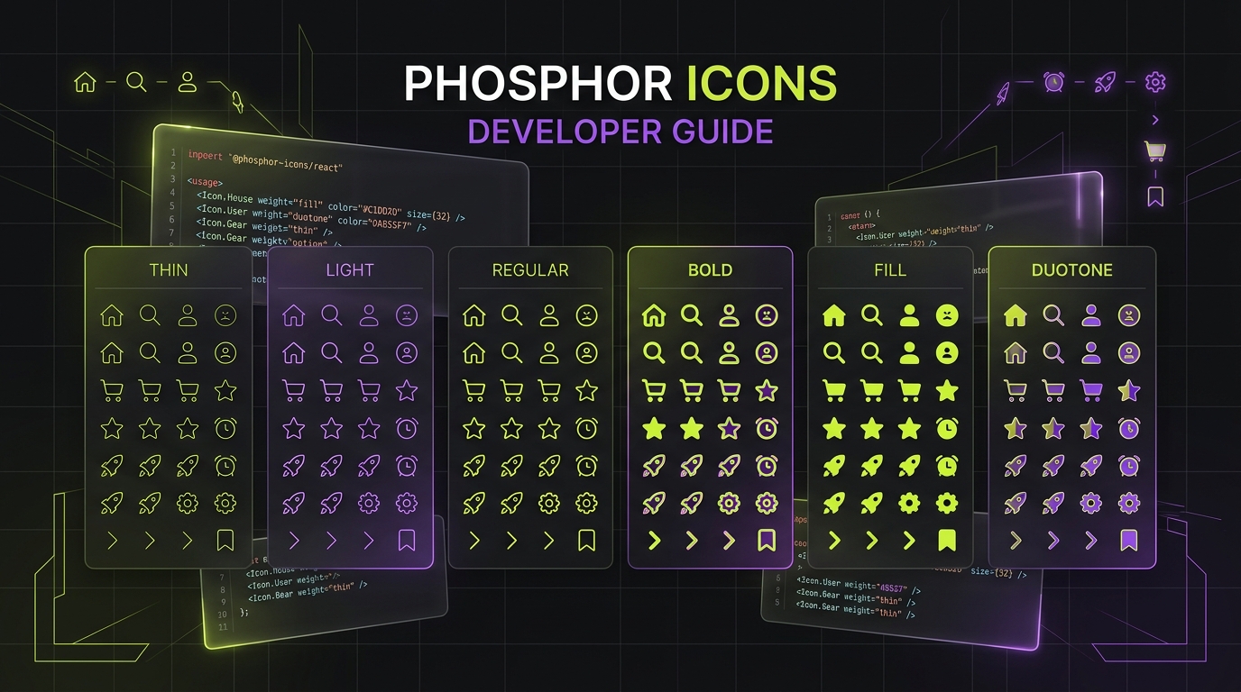
Executive Summary: Phosphor Icons is one of the fastest-growing open-source iconography systems in web development. Built by Helena Zhang and Toby Fried, Phosphor provides over 9,000 vector glyphs rendered consistently across six distinct optical weights on a 24x24 grid. In this complete engineering guide, you will master:
- The Six Weight Continuum: Choosing between Thin (1px), Light (1.5px), Regular (2px), Bold (2.5px), Fill, and Duotone for harmonious typography pairing.
- Multi-Framework Setup: Installing and configuring tree-shakable packages across React 19 (RSC safe), Vue 3.5, Svelte 5, and vanilla HTML/CSS.
- Centralized Icon Context: Using
IconContext.Providerto orchestrate global weight, size, color, and RTL mirroring across entire design systems. - Duotone Color Engineering: Controlling secondary layer opacity (20% default) and multi-tone brand colors with native CSS variables.
1. Why Phosphor Icons Dominates Modern Design Systems
While libraries like Lucide and Feather pioneered clean 24x24 geometric lines, frontend teams often hit a critical architectural wall when their typography system expands: a single stroke weight (2px) looks too heavy beside delicate 300-weight editorial type, and lacks sufficient visual punch when paired with heavy 800-weight display headings or active navigation states.
Phosphor Icons solves this dilemma at the core. Every single concept in its catalog of 1,250+ unique icons is drafted across six distinct optical weights, producing over 9,000 individual vector assets. Furthermore, it ships under the permissive MIT License, making it 100% free for commercial SaaS platforms, mobile applications, and enterprise design systems.
On IconStash's Phosphor Hub, developers can instantly search, live-preview across all six weights, customize stroke colors, and copy raw SVG markup, React JSX, or Vue templates in a single click.
2. The Six Visual Weights: Anatomy & Semantic Use Cases
Phosphor's six weights are mathematically aligned to the 24x24 pixel grid with rounded caps and corner joins:
- Thin (1.0px stroke): Delicate, high-fashion aesthetic. Best paired with display typography (40px+), light interface headings, or dense data visualization where icons must not distract from numbers.
- Light (1.5px stroke): Modern, airy feel. Ideal for mobile interfaces and iOS-inspired clean design systems paired with 400-weight Inter or Roboto.
- Regular (2.0px stroke): The default workhorse weight. Offers balanced contrast and universal readability across standard body copy (14px to 16px).
- Bold (2.5px stroke): High-emphasis states. Perfect for selected navigation tabs, active filters, warning banners, and button iconography.
- Fill (Solid Silhouette): Fully filled geometric mass. Used to indicate "active" or "selected" states in bottom tab bars (e.g., changing from a Regular heart to a Fill heart on favorite).
- Duotone (Layered Opacity): Features a primary outline path (100% opacity) combined with an underlying filled shape at 20% opacity. Provides dimensional depth without 3D bloat.
A standard UX pattern with Phosphor is pairing Regular or Light for idle navigation items with Bold or Fill for active/selected items. This establishes clear visual hierarchy without needing separate icon sets.
3. React 19 & Next.js 15 Implementation: Server Components & Bundling
Phosphor provides the official @phosphor-icons/react package. To install it:
npm install @phosphor-icons/react
# or
pnpm add @phosphor-icons/react
Basic Usage & Named Tree-Shaking Imports
Always use named ES module imports to guarantee that Rollup, Vite, or Webpack tree-shakes unused icons from your client bundle:
import React from 'react';
import { House, MagnifyingGlass, Gear, Heart } from '@phosphor-icons/react';

export function NavigationBar() {
  return (
    <nav className="flex items-center gap-6">
      {/* Default Regular weight, inherits parent text color */}
      <House size={24} />

      {/* Explicit weight override */}
      <MagnifyingGlass size={24} weight="light" />

      {/* Active state using Fill weight and brand accent */}
      <Heart size={24} weight="fill" color="#C1DD2D" />

      {/* Duotone styling */}
      <Gear size={24} weight="duotone" className="text-neutral-300" />
    </nav>
  );
}
Next.js 15 App Router & Server Components
Because individual Phosphor icon components render pure SVG markup with zero client-side React hooks (no useState or useEffect), they are 100% Server Component safe! You can import them directly inside Server Components without adding the 'use client' directive, resulting in 0 KB client JavaScript overhead.
4. Centralized Theming with IconContext.Provider
Passing size={24} and weight="regular" to hundreds of individual icon components creates repetitive code and maintenance friction. Phosphor solves this with IconContext.Provider:
'use client';

import React from 'react';
import { IconContext } from '@phosphor-icons/react';

export function IconProvider({ children }: { children: React.ReactNode }) {
  return (
    <IconContext.Provider
      value={{
        color: 'currentColor',
        size: 24,
        weight: 'regular',
        mirrored: false, // Automatically flips for RTL languages if true
        className: 'transition-colors duration-150',
      }}
    >
      {children}
    </IconContext.Provider>
  );
}
When placed in your root layout or design system shell, any child icon that doesn't define explicit props automatically inherits the global context values. You can still override individual icons whenever needed:
<!-- Inherits size=24 and weight=regular from IconContext -->
<Bell />

<!-- Overrides size and weight for a specific callout banner -->
<Bell size={32} weight="bold" color="#EF4444" />
5. Mastering Duotone Icons: Two-Tone Palette Engineering
Phosphor Duotone icons are crafted using two internal SVG path groups:
- A primary stroke layer rendered at 100% opacity.
- A secondary fill layer rendered at 20% opacity (
opacity="0.2").
By default, both layers inherit the CSS color property via currentColor. This means setting color: #C1DD2D turns the outline into solid neon lime and the background fill into a delicate 20% lime tint automatically.
Advanced Two-Tone Coloring with CSS Custom Properties
If you want the outline to be one color (e.g., white or dark gray) and the secondary fill to be a contrasting brand color (e.g., electric green or purple), you can target the opacity="0.2" attribute selector in CSS:
/* Custom Duotone Secondary Color Styling */
.duotone-custom {
  color: #F2F2F2; /* Primary outline stroke */
}

.duotone-custom path[opacity="0.2"] {
  fill: #C1DD2D !important; /* Secondary fill accent */
  opacity: 0.35 !important;  /* Elevated opacity for punchy contrast */
}

/* Dark/Light mode dynamic switching */
html[data-theme="light"] .duotone-custom {
  color: #1A1A1A;
}
html[data-theme="light"] .duotone-custom path[opacity="0.2"] {
  fill: #708A00 !important;
  opacity: 0.25 !important;
}
6. Vue 3.5 & Vanilla HTML/Web Component Setup
Vue 3.5 Setup with @phosphor-icons/vue
npm install @phosphor-icons/vueIn Vue Single File Components (SFCs), Phosphor icons are used as native components with typed props:
<script setup lang="ts">
import { PhHouse, PhGear, PhChartLine } from '@phosphor-icons/vue';
</script>

<template>
  <div class="dashboard-nav">
    <PhHouse :size="20" weight="bold" />
    <PhChartLine :size="20" weight="duotone" class="text-lime-500" />
    <PhGear :size="20" weight="light" />
  </div>
</template>
Vanilla HTML & Vanilla JS (@phosphor-icons/web)
For projects built without modern bundlers or frameworks, Phosphor provides a web font and CSS class bundle:
<!-- Load Phosphor Icons stylesheet via CDN -->
<link rel="stylesheet" href="https://unpkg.com/@phosphor-icons/[email protected]/src/regular/style.css">

<!-- Usage with semantic i tags -->
<i class="ph ph-house" style="font-size: 24px;"></i>
<i class="ph-bold ph-magnifying-glass"></i>
<i class="ph-duotone ph-gear"></i>
7. Benchmark: Phosphor vs Lucide vs Tabler vs Heroicons
How does Phosphor compare against other leading open-source icon libraries in production metrics? The table below highlights key differences:
| Library | Total Icons | Weights / Styles | React Bundle / Icon | RSC Safe | Duotone Support | License |
|---|---|---|---|---|---|---|
| Phosphor Icons | 9,198 (1,250+ × 6) | 6 (Thin, Light, Regular, Bold, Fill, Duotone) | ~1.3 KB | Yes (0 KB client JS) | Native 20% opacity | MIT |
| Lucide Icons | 1,498 | 1 (Stroke adjustable via CSS) | ~1.1 KB | Yes (0 KB client JS) | None (Outline only) | ISC |
| Tabler Icons | 6,324 | 2 (Outline + Filled) | ~1.4 KB | Yes | None | MIT |
| Heroicons | 1,297 (across 4 grids) | 4 (24px Outline, 24px Solid, 20px Mini, 16px Micro) | ~1.2 KB | Yes | None | MIT |
8. Accessible Icon Patterns with Phosphor
Icons in user interfaces serve either decorative or informative roles. Phosphor components accept all standard ARIA attributes:
1. Decorative Icons (Beside Visible Text)
When an icon accompanies descriptive text (e.g., inside a button labeled "Download PDF"), the icon must be hidden from screen readers to prevent redundant announcements:
<button className="btn-primary">
  <DownloadSimple size={20} aria-hidden="true" />
  <span>Download Report</span>
</button>
2. Informative Standalone Icons (Icon-Only Buttons)
When an icon is the only element inside a button (such as a trash can for delete), you must provide an accessible label via aria-label on the interactive button element:
<button aria-label="Delete invoice" className="btn-icon-danger">
  <Trash size={20} aria-hidden="true" />
</button>
Frequently Asked Questions
What are the six weights included in Phosphor Icons?
Phosphor Icons includes Thin (1px stroke), Light (1.5px stroke), Regular (2px stroke), Bold (2.5px stroke), Fill (solid silhouette), and Duotone (two-tone with primary stroke and 20% opacity secondary fill).
Does @phosphor-icons/react support Next.js 15 and React Server Components?
Yes. Phosphor Icons components export pure functional SVG elements that render natively in React Server Components without requiring client JavaScript bundles. When using IconContext.Provider, wrap the provider in a Client Component boundary while keeping individual icons as zero-runtime server rendered SVGs.
How do you customize the secondary color and opacity of Phosphor Duotone icons?
Phosphor Duotone icons use opacity='0.2' on secondary fill paths by default while inheriting color via currentColor. To customize the secondary layer, you can target the path element in CSS using svg path[opacity='0.2'] or apply CSS custom properties to override fill and opacity dynamically.
Is Phosphor Icons fully free for commercial applications?
Yes. Phosphor Icons is licensed under the permissive MIT license. You can use, modify, distribute, and embed all 9,000+ icons in commercial web applications, mobile apps, SaaS dashboards, and marketing materials with zero royalties.
How does Phosphor Icons compare to Lucide in bundle size?
Both libraries feature tree-shakable ES modules. Lucide icons average 1.1 KB to 1.3 KB per icon, while Phosphor Icons average 1.2 KB to 1.6 KB per icon (due to multi-weight and duotone path definitions). Both achieve zero bundle bloat when imported via named ES imports.