Interactive SVG Icon Animations with Pure CSS and JavaScript
Learn how to build lightweight, high-performance micro-interactions using CSS keyframes, transitions, and dash-array stroke adjustments.
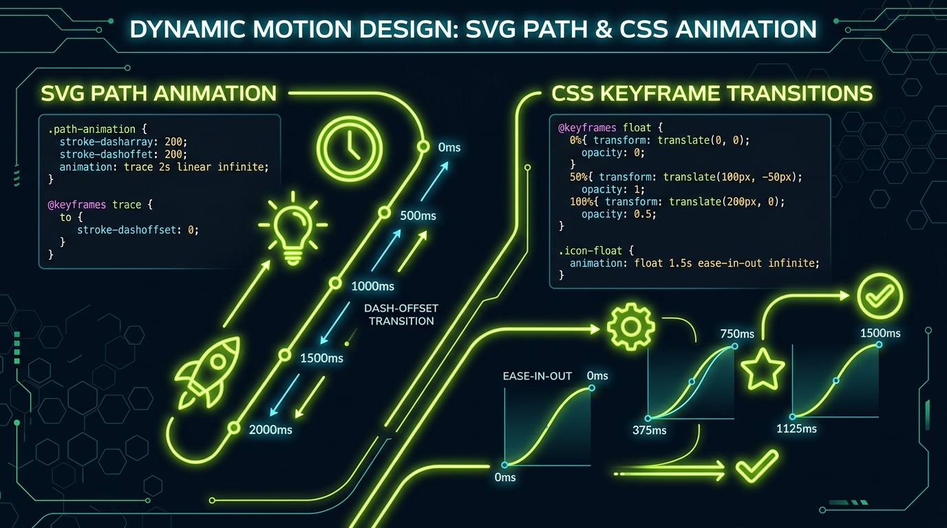
1. The Role of Micro-Interactions in Modern UI
System icons aren't just static images — they are interactive focal points. Small, fluid vector animations (known as **micro-interactions**) improve the user experience by providing clear visual feedback upon hover, click, or state transitions.
Because SVGs are treated as regular markup elements by the browser, you can style individual sub-elements (like a folder flap, gear teeth, or notification badge) independently using CSS classes and transitions.
2. Basic Hover Animations (Rotate, Scale, Shift)
The simplest way to animate icons is by targeting the entire container or specific groups (<g>) inside the SVG using CSS transitions. A common mistake is not defining the `transform-origin`:
/* Animate gear rotation on card hover */
.system-card:hover .icon-gear {
  transform: rotate(45deg);
  transform-origin: center;
  transition: transform 300ms cubic-bezier(0.4, 0, 0.2, 1);
}
Without setting `transform-origin: center`, the browser will rotate the shape relative to the top-left corner of the viewport canvas, resulting in erratic displacements.
3. The Line-Drawing Trick (stroke-dasharray & stroke-dashoffset)
To create a dynamic "drawing" or "filling" animation (where paths trace themselves in real-time), use CSS properties `stroke-dasharray` and `stroke-dashoffset`:
/* Tracing path effect for load or checkmark states */
.drawing-path {
  stroke-dasharray: 100;
  stroke-dashoffset: 100;
  animation: drawLine 1.5s ease-in-out forwards;
}

@keyframes drawLine {
  to {
    stroke-dashoffset: 0;
  }
}
This trick creates the look of an invisible line tracing its own route, which is excellent for success checkmarks, loading wheels, or interface progress widgets.
4. Controlling Complex Timelines with JavaScript
For complex animations (like swapping a menu icon into a close icon, or complex multi-step processes), CSS alone may not be enough. In these cases, use JavaScript to toggle classes and trigger animations based on user input events:
// Toggle menu active state dynamically
const menuBtn = document.getElementById("mobile-menu-trigger");

menuBtn.addEventListener("click", () => {
  const isActive = menuBtn.classList.toggle("active");
  menuBtn.setAttribute("aria-expanded", String(isActive));

  // Custom JS logic to trigger SVG morphing or path shifts
  const paths = menuBtn.querySelectorAll("path");
  if (isActive) {
    paths[0].style.transform = "translate(4px, 4px) rotate(45deg)";
  } else {
    paths[0].style.transform = "none";
  }
});
Summary Guidelines
- Use hardware acceleration: Animate properties like `transform` and `opacity` instead of coordinates (`x`, `y`, `width`) to ensure smooth 60fps renders.
- Define origins carefully: Set `transform-origin: center center` explicitly on sub-elements to avoid layout displacement.
- Keep it subtle: Animations should be fast and non-distracting — usually between `150ms` and `300ms`.