Designing Consistent Icon Systems for SaaS User Interfaces
Craft cohesive, balanced, and premium vector graphics that integrate seamlessly into complex dashboard interfaces and software products.
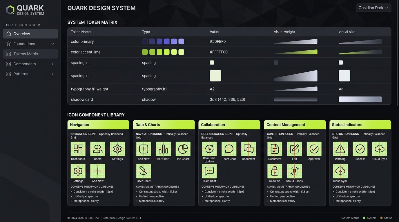
1. The 24px Vector Grid & Padding Rules
In SaaS user interfaces, icons must render cleanly alongside typography in dense layouts. The industry standard for system icons is a **24px x 24px grid** with a nested **2px safety margin** (active area of 20px x 20px).
Establishing a grid guarantees that shapes stay sharp on high-DPI displays. Placements and stroke alignments should snapped to whole integers to prevent decimal offsets which result in blurry, anti-aliased edges.
Padding Exception: Icons with horizontal or vertical extensions (like a long arrow or divider) can occasionally extend into the 2px safety zone to maintain correct visual alignment with adjacent shapes.
2. Mastering Optical Weight & Alignment
Mathematical alignment (using the exact bounding box center) often fails visually. Different geometric shapes of the exact same pixel dimensions carry distinct **optical weight**:
- Squares: Carry the highest visual density. They should typically be sized slightly smaller (e.g. 18px) to fit in with circles.
- Circles: Have less density. They must extend further toward the edges of the active area (e.g. 20px).
- Triangles: Have the lowest optical weight. They need to scale larger and require their center of gravity to be shifted horizontally or vertically to appear visually balanced.
When aligning a play icon (triangle) inside a circle button, shift the play vector slightly to the right of the mathematical center so it looks visually balanced.
3. Cohesive Line Weight & Terminals
A consistent stroke weight is the primary driver of cohesion in a design system. Mixing stroke weights (like 1.5px and 2px) in the same layout causes interface elements to feel disjointed.
Furthermore, ensure shape terminals (ends of lines) and corners are uniform across the icon set:
/* Standardized styling rules for system vectors */
svg.system-icon {
  stroke-width: 2px;
  stroke-linecap: round;  /* Round corners for open paths */
  stroke-linejoin: round; /* Cohesive corner joints */
  fill: none;
}
4. Organizing Assets for Developer Handoff
A consistent naming convention bridges the gap between designers and developers. Use lowercase kebab-case and structure names by **category-action-modifier** rather than arbitrary descriptions:
/* Structuring icon files logically */
- navigation-arrow-left.svg
- navigation-arrow-right.svg
- media-play-filled.svg
- media-pause-stroke.svg
- commerce-cart-add.svg
This layout ensures that assets group together automatically in code repositories and asset search tools.
Key Summary Rules
- Respect the grid: Always align shapes to integer pixels to keep lines crisp.
- Compensate for geometry: Scale squares down and triangles up to preserve optical parity.
- Enforce one line weight: Select a single stroke width (2px is recommended for SaaS dashboards) and apply it universally.
- Design with context: View icons at their target layout size (usually 16px or 20px) during the design process, not zoomed in at 800%.