Designing Accessible SVG Icons: The Complete WCAG 2.2 Guide
Web accessibility is not an afterthought — it is a legal and ethical requirement. This guide demonstrates how to properly categorize, markup, and test SVG icons to achieve 100% WCAG 2.2 Level AA compliance.
- The 2 Golden Rules: Decorative icons (hide them) vs Informative icons (label them).
- Implement accessible standalone icon buttons with
aria-labeland keyboard focus rings. - Ensure compatibility with screen readers (NVDA, VoiceOver, JAWS) and High Contrast mode.
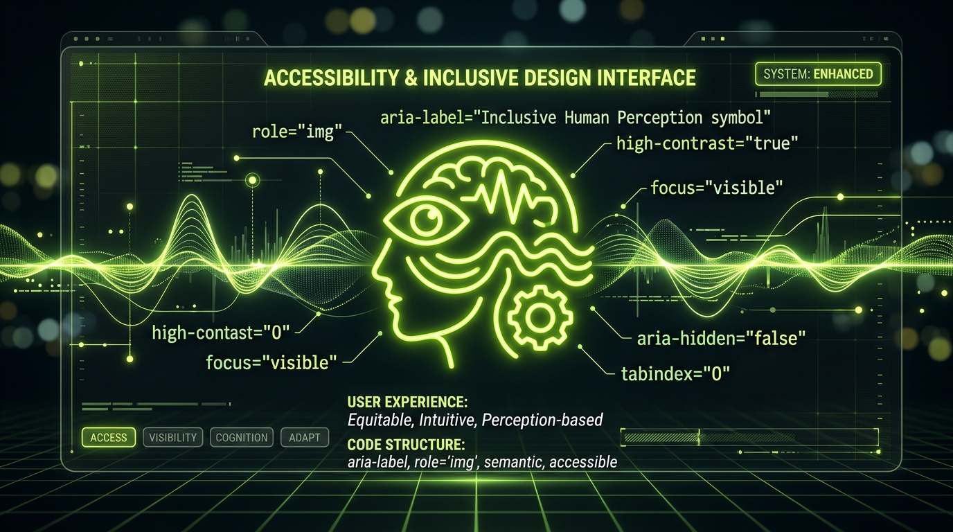
1. The Two Fundamental Icon Categories
Every icon in your UI falls strictly into one of two categories:
A. Decorative Icons
If an icon accompanies visible text that already conveys the meaning (e.g. a shopping cart icon next to "Checkout"), the icon is purely decorative. If announced by a screen reader, it creates redundant audio clutter.
Rule: Always hide decorative icons using aria-hidden="true":
<button class="btn">
  <svg aria-hidden="true" focusable="false" viewBox="0 0 24 24" width="20" height="20">
    <path d="..." fill="none" stroke="currentColor" stroke-width="2" />
  </svg>
  <span>Add to Cart</span>
</button>
B. Informative & Interactive Icons
When an icon stands alone with no visible text (such as a hamburger menu button, a trash can delete icon, or a search magnifying glass), the icon provides critical meaning.
Rule: Provide an explicit accessible name on the parent interactive element or via semantic SVG markup:
<!-- Option 1: On Parent Button (Recommended) -->
<button aria-label="Delete user account" class="icon-btn">
  <svg aria-hidden="true" viewBox="0 0 24 24" width="24" height="24">
    <path d="..." />
  </svg>
</button>

<!-- Option 2: Semantic Standalone SVG -->
<svg role="img" aria-labelledby="status-title" viewBox="0 0 24 24" width="24" height="24">
  <title id="status-title">Database connection active</title>
  <path d="..." />
</svg>
2. Focus Rings & Keyboard Navigation
SVG elements themselves should never be keyboard-focusable unless they serve as interactive links. In Internet Explorer and older web views, SVGs could accidentally receive tab focus. Ensure focusable="false" is included alongside aria-hidden="true".
3. Windows High Contrast Mode & Forced Colors
Users with low vision often enable Windows High Contrast or system forced-colors modes. When you use hardcoded hex fills (e.g. fill="#4F46E5"), the OS cannot recolor the icon against the high-contrast background.
By using stroke="currentColor" or fill="currentColor", the vector automatically inherits the system's high-contrast foreground color (such as CanvasText or ButtonText).
4. Frequently Asked Questions
Does <title> work as a tooltip?
Yes, in desktop browsers hovering over an SVG with a <title> tag displays a native browser tooltip, while also providing an accessible name when paired with aria-labelledby.
Discover 134,701 accessible open-source vector icons at IconStash.