Dark Mode Icons — Adapting SVG for Light & Dark Themes
An exhaustive guide to building resilient, theme-aware SVG icons using modern CSS features, custom properties, and intelligent contrast mapping.
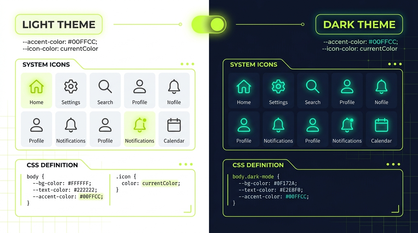
1. The Problem: Why Icons Break in Dark Mode
Dark mode adoption is no longer a niche user preference—it is a baseline expectation for modern web applications. Whether users enable it to reduce eye strain, conserve battery life on OLED screens, or simply because it looks sleek, developers must accommodate both light and dark themes flawlessly.
However, when interfaces transition from light to dark, icons are frequently the first visual element to break. If you have ever flipped a theme switch only to see your navigation icons completely disappear into the background, you have experienced the pitfalls of improperly implemented vector graphics.
The core issues usually stem from a few common anti-patterns in SVG management:
- Contrast inversion failure: Icons designed with hardcoded dark strokes or fills against a light background become practically invisible when the background switches to a dark color.
- Hardcoded colors: SVGs exported directly from design tools like Figma or Illustrator often contain hardcoded hex values (e.g.,
fill="#000000"orstroke="#333333") deeply nested within their markup. - Loss of multi-tone fidelity: Two-tone icons that use subtle greys to convey depth in a light theme can look muddy, jarring, or inverted incorrectly in a dark context.
To solve this, we must decouple the structural geometry of the SVG from its presentation. By shifting color control from the HTML markup to the CSS layer, we can create truly dynamic, context-aware icons that adapt effortlessly to any design system.
2. The currentColor Technique: Your Best Friend
If you only take away one concept from this article, let it be this: currentColor is the single most powerful tool in your SVG styling arsenal. It acts as a bridge between your typography colors and your icon colors.
The currentColor keyword in CSS instructs the browser to use the current computed value of the color property. When applied to an SVG's fill or stroke, the icon will automatically inherit the text color of its parent container. This makes adapting icons to dark mode entirely automatic, provided your text colors are already theme-aware.
Before: Hardcoded SVG (Anti-pattern)
<!-- This icon will disappear on a dark background -->
<svg width="24" height="24" viewBox="0 0 24 24" fill="none">
  <path d="M12 2L2 22h20L12 2z" fill="#111827" />
</svg>
After: Theme-Aware SVG using currentColor
<!-- This icon inherits the parent's text color -->
<svg width="24" height="24" viewBox="0 0 24 24" fill="none">
  <path d="M12 2L2 22h20L12 2z" fill="currentColor" />
</svg>

<style>
  .icon-container {
    color: #111827; /* Light mode color */
  }

  @media (prefers-color-scheme: dark) {
    .icon-container {
      color: #F9FAFB; /* Dark mode color - icon updates automatically! */
    }
  }
</style>
By replacing hardcoded hex values with currentColor, you eliminate the need to write separate CSS rules for every individual icon state. Your icons simply become part of the typographic flow.
3. CSS Custom Properties for Multi-Tone Icons
While currentColor is perfect for monochromatic glyphs, modern design systems frequently utilize duo-tone or multi-tone icons. These icons typically have a primary active color and a secondary, more subtle accent color.
To make multi-tone icons themeable, we can leverage CSS Custom Properties (variables). By mapping specific parts of the SVG to CSS variables, we can independently control different layers of the icon based on the active theme.
<!-- Duo-tone Cloud Icon -->
<svg class="icon-duotone" viewBox="0 0 24 24" fill="none" xmlns="http://www.w3.org/2000/svg">
  <!-- Primary path (border) -->
  <path class="icon-primary" d="M17.5 19C19.9853 19..." stroke="var(--icon-primary)" stroke-width="2"/>
  <!-- Secondary path (fill) -->
  <path class="icon-secondary" d="M17.5 19C19.9853 19..." fill="var(--icon-secondary)"/>
</svg>

<style>
  /* Light Theme Defaults */
  :root {
    --icon-primary: #374151;   /* Dark slate */
    --icon-secondary: #E5E7EB; /* Light grey */
  }

  /* Dark Theme Overrides */
  [data-theme="dark"] {
    --icon-primary: #F3F4F6;   /* Light grey */
    --icon-secondary: #374151; /* Dark slate */
  }
</style>
This approach provides granular control. In light mode, the cloud might have a dark outline and a light fill. In dark mode, you can invert this relationship, or completely alter the hue of the secondary layer to match a dark-themed accent color. CSS variables give you the flexibility to tune the precise luminance levels needed for dark backgrounds.
4. The prefers-color-scheme Media Query
The @media (prefers-color-scheme: dark) media query allows your web application to detect the user's operating system-level theme preference. It is the foundation of automatic theme switching.
When styling icons, you can use this media query to redefine your CSS variables or swap out colors without requiring JavaScript intervention.
/* Base styles (Light mode by default) */
.nav-icon {
  fill: #4B5563;
  transition: fill 0.3s ease;
}
.nav-icon:hover {
  fill: #2563EB; /* Blue accent */
}

/* OS-level Dark Mode Detection */
@media (prefers-color-scheme: dark) {
  .nav-icon {
    fill: #9CA3AF;
  }
  .nav-icon:hover {
    fill: #60A5FA; /* Lighter blue for dark mode contrast */
  }
}
This ensures that users visiting your site immediately receive a visually comfortable experience that aligns with their system settings. However, relying solely on media queries removes control from the user. What if they want to override the OS preference for your specific site? This brings us to data attributes.
5. Data Attribute Theming for Explicit Overrides
While prefers-color-scheme is fantastic for initial detection, robust web applications allow users to explicitly toggle between light and dark modes via a UI switch.
The most resilient way to handle this is by applying a data-theme attribute to the <html> tag and using it as a high-level CSS selector. This creates a deterministic state that can easily override media queries.
/* 1. Define variables at the root for both themes */
:root {
  --text-color: #111827;
  --icon-color: #4B5563;
  --bg-color: #FFFFFF;
}

[data-theme='dark'] {
  --text-color: #F9FAFB;
  --icon-color: #D1D5DB;
  --bg-color: #111827;
}

/* 2. Fallback to OS preference if no explicit theme is set */
@media (prefers-color-scheme: dark) {
  :root:not([data-theme="light"]) {
    --text-color: #F9FAFB;
    --icon-color: #D1D5DB;
    --bg-color: #111827;
  }
}

/* 3. Apply to your UI components */
body {
  background-color: var(--bg-color);
  color: var(--text-color);
}

.system-icon {
  color: var(--icon-color);
  fill: currentColor;
}
This architecture is highly scalable. You establish the data attribute as the absolute source of truth. If a user flips your app's dark mode toggle, JavaScript simply sets document.documentElement.setAttribute('data-theme', 'dark'), and all your icons will update instantaneously.
6. Handling Complex Multi-Color Icons & Illustrations
Simple glyphs are easy to theme. But what happens when you have a complex SVG illustration, a brand logo, or an icon containing embedded raster elements?
For complex vectors, rewriting every single fill and stroke to use CSS variables might be impractical. In these cases, you can utilize CSS filters to mathematically invert and adjust the colors of the entire SVG element.
/* Applying CSS filters to invert complex artwork for dark mode */
.complex-illustration {
  transition: filter 0.3s ease;
}

[data-theme='dark'] .complex-illustration {
  /*
    1. invert(1) flips all colors (black becomes white, white becomes black).
    2. hue-rotate(180deg) corrects the inverted colors back to their original hue spectrum.
    3. brightness/contrast adjustments fine-tune the result for a dark background.
  */
  filter: invert(1) hue-rotate(180deg) brightness(1.2) contrast(0.9);
}
This technique is particularly useful for user-generated content, external badges, or complex product graphics where you don't control the underlying markup. While not as precise as mapping CSS variables, it provides a functional "quick fix" for preserving legibility in dark environments.
7. Contrast Ratios & WCAG Compliance
In dark mode, the rules of visual contrast change. A color that looks great on a white background might fail accessibility standards on a dark grey background.
The Web Content Accessibility Guidelines (WCAG) require a minimum contrast ratio of 3:1 for UI components and graphical objects (like icons). In dark themes, achieving this often means utilizing lighter, desaturated colors. Highly saturated colors can cause "halation" (a glowing effect) against dark backgrounds, making shapes difficult to parse.
If you are building a design system, it's crucial to mathematically verify your icon colors. Here is a handy JavaScript function you can use during development to calculate the contrast ratio between an icon color and its background:
// Calculate relative luminance
function getLuminance(r, g, b) {
  const a = [r, g, b].map(function (v) {
    v /= 255;
    return v <= 0.03928 ? v / 12.92 : Math.pow((v + 0.055) / 1.055, 2.4);
  });
  return a[0] * 0.2126 + a[1] * 0.7152 + a[2] * 0.0722;
}

// Calculate contrast ratio between two RGB colors
function getContrastRatio(color1, color2) {
  const lum1 = getLuminance(color1.r, color1.g, color1.b);
  const lum2 = getLuminance(color2.r, color2.g, color2.b);
  const brightest = Math.max(lum1, lum2);
  const darkest = Math.min(lum1, lum2);
  return (brightest + 0.05) / (darkest + 0.05);
}

// Example usage: Dark background vs Light Grey icon
const bg = { r: 17, g: 24, b: 39 };     // #111827
const icon = { r: 209, g: 213, b: 219 }; // #D1D5DB
const ratio = getContrastRatio(bg, icon);

console.log(`Contrast Ratio: ${ratio.toFixed(2)}:1`);
// If ratio >= 3.0, the icon passes WCAG AA for UI graphics!
Pro tip: In dark mode, try to avoid pure white (#FFFFFF) for icons against pure black (#000000). The contrast is actually *too* high and can cause eye strain. Instead, use an off-white (like#F3F4F6) against a very dark grey (like#111827).
8. Icon Opacity Strategies in Dark Environments
A sophisticated technique in dark mode design is manipulating opacity rather than just color. In light themes, inactive icons are often colored grey. In dark themes, relying heavily on grey hex values can look muddy.
Instead of defining a specific grey hex code for inactive or secondary icons, apply white with a reduced opacity. This allows the icon to blend naturally with the underlying dark background, adopting the background's hue and preserving visual harmony across different surface elevations.
/* The Opacity Strategy */
:root {
  --icon-active: rgba(0, 0, 0, 0.87);
  --icon-inactive: rgba(0, 0, 0, 0.54);
}

[data-theme='dark'] {
  /* Using white with alpha channels for perfect blending */
  --icon-active: rgba(255, 255, 255, 1);
  --icon-inactive: rgba(255, 255, 255, 0.5);
  --icon-disabled: rgba(255, 255, 255, 0.3);
}

.action-icon {
  color: var(--icon-inactive);
}
.action-icon:hover {
  color: var(--icon-active);
}
By using alpha channels, if an icon sits on a dark blue navigation bar, it becomes a lighter dark blue. If it sits on a dark grey card, it becomes a lighter dark grey. It's an elegant, scalable solution for massive design systems.
9. Implementing Smooth Theme Transitions
When a user toggles the theme, the transition between light and dark shouldn't be a jarring, instant snap. Adding a subtle CSS transition to your colors creates a premium, polished feel. Since SVG fill, stroke, and color properties are completely animatable, this is straightforward to implement.
/* Smooth color transitions for all themeable properties */
body,
.icon,
.theme-toggle-btn {
  transition:
    background-color 300ms ease,
    color 300ms ease,
    fill 300ms ease,
    stroke 300ms ease,
    border-color 300ms ease;
}

/* Ensure SVGs inherit the transition if they rely on currentColor */
svg {
  transition: inherit;
}
However, be cautious: applying transitions universally via * { transition: ... } can cause significant layout thrashing and performance lag, especially on complex pages. It is better to explicitly scope your transitions to the specific elements and properties that will actually change during a theme swap.
10. Real-World Case Study: Building a Theme-Aware Icon Toolbar
Let's pull everything together into a practical example: a floating rich-text formatting toolbar. This component uses currentColor, CSS custom properties for hover states, opacity strategies for inactive icons, and smooth transitions.
<!-- HTML Structure -->
<div class="format-toolbar">
  <button class="tool-btn" aria-label="Bold">
    <svg viewBox="0 0 24 24" fill="none" stroke="currentColor" stroke-width="2">
      <path d="M6 4h8a4 4 0 014 4 4 4 0 01-4 4H6z" />
      <path d="M6 12h9a4 4 0 014 4 4 4 0 01-4 4H6z" />
    </svg>
  </button>
  <button class="tool-btn" aria-label="Italic">
    <svg viewBox="0 0 24 24" fill="none" stroke="currentColor" stroke-width="2">
      <line x1="19" y1="4" x2="10" y2="4" />
      <line x1="14" y1="20" x2="5" y2="20" />
      <line x1="15" y1="4" x2="9" y2="20" />
    </svg>
  </button>
</div>

<style>
/* SCSS/CSS Architecture */
:root {
  --toolbar-bg: #FFFFFF;
  --toolbar-border: #E5E7EB;
  --btn-hover-bg: #F3F4F6;
  --icon-base: rgba(17, 24, 39, 0.6); /* 60% opacity dark text */
  --icon-hover: rgba(17, 24, 39, 1);  /* Solid dark text */
}

[data-theme='dark'] {
  --toolbar-bg: #1F2937;
  --toolbar-border: #374151;
  --btn-hover-bg: #374151;
  --icon-base: rgba(255, 255, 255, 0.6); /* 60% opacity white text */
  --icon-hover: rgba(255, 255, 255, 1);  /* Solid white text */
}

.format-toolbar {
  display: inline-flex;
  gap: 4px;
  padding: 6px;
  background-color: var(--toolbar-bg);
  border: 1px solid var(--toolbar-border);
  border-radius: 8px;
  box-shadow: 0 4px 6px -1px rgba(0, 0, 0, 0.1);
  transition: background-color 300ms ease, border-color 300ms ease;
}

.tool-btn {
  background: transparent;
  border: none;
  border-radius: 4px;
  padding: 8px;
  cursor: pointer;
  color: var(--icon-base);
  transition: background-color 200ms ease, color 200ms ease;
}

.tool-btn:hover {
  background-color: var(--btn-hover-bg);
  color: var(--icon-hover);
}

.tool-btn svg {
  width: 20px;
  height: 20px;
  display: block;
}
</style>
In this example, the icons never declare their own colors. They simply inherit the color property of the .tool-btn. The button, in turn, maps its color to our CSS variables (--icon-base and --icon-hover), which utilize the opacity strategy we discussed earlier. The result is an incredibly robust component that responds perfectly to system theme changes, explicit user toggles, and user interactions.
Checklist for Dark Mode Icons
- Audit your exports: Remove hardcoded
fillandstrokehex codes from your raw SVG files. - Embrace currentColor: Use it as your primary technique for contextual icon coloring.
- Utilize CSS Variables: Map specific path elements to variables for complex, multi-tone iconography.
- Verify contrast: Ensure your dark mode colors hit a minimum of 3:1 WCAG contrast ratio against their backgrounds.
- Test with real users: Allow users to override the OS preference and ensure transitions between states are smooth and non-disruptive.